 |
| Crate Paper - Paper Heart Collection - Valentine, Crate Paper - Paper Heart Collection - Friendship, Crate Paper - Paper Heart Collection - Cupid, Tattered Angels Glimmer Mist - Silver Sugar |
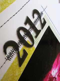
I had a lot of problems at first with colors. All the papers I put next to the picture just overwhelmed it or competed with it. If I picked a pink paper... it looked too violet. If I picked a violet paper...it looked too pink. So, I decided to go with a simple layout using a complementary color. I pulled out Crate Paper's 'Paper Heart' collection and it was just the ticket. The red-violet and yellow-green worked perfectly together. It was such a fun splash of color. (Oh, and a little bit of wood grain never hurts!)
One thing that I always have to watch for is what I call a 'sneaky color'. It's a color that looks like it shouldn't belong but you can't avoid. It might be that strange beach ball in the background that threw in a color you didn't want. For me, it was the lighting in the cave that turned the outside of my photo black. The colors of my papers would've looked best with grey as the dominant color, but I didn't have grey in my picture. So, instead of fighting that sneaky color, I embraced it. I made it my most used color. All the fonts, the stitching, everything was dashed with a bit of black.


7 comments:
I love what you have done - you picked the perfect papers!!!
I love all the stitching and the colors are great, way to work it out!
Love the stitching! Really pulls the whole thing together and makes it complete.
really love the colors and the stiching!
Great job on this layout! You must not live too far from me, as I live on the border of AL, I even have a house in Bridgeport. Love Ruby Falls! I can remember going as a kid, and it was quite different back then! Love Penny
Hey Tiffany, head on over to my blog, I've got something for you!!
This is so pretty, love it!
Post a Comment