Showing posts with label layout. Show all posts

Tuesday, September 8, 2015

Webster's Pages - So Many Layers

It's so hard to imagine that I've been married for 3 years now. Where has the time gone? It seems like I'm living day to day and suddenly look back to see that another month has passed. Wow, it sure sneaks up on me! When I think back to my wedding day, I can't help but smile and laugh at most of it. As a bride I agonized over every small detail and thought that I had made enough plans (and spread sheets) to have complete control over my wedding.    Ha! Not even close!

The actual day seemed to dash by in a blur: tons of things that I forgot or forgot to do. Hubbie even had to drive back to his parents' home because I forgot my shoes! Well, getting myself into that corset and dress by myself was like trying to zip up a Spandex sleeping bag. After I had finally squeezed myself in and zipped myself up, I stood back to admire my handywork. Only then did I realize that I had forgotten to put on my puffy slip.... the one that has to go on first before everything else.

I was very tempted to get frustrated and start systematically ripping off my dress, but instead I smiled and said a very enthusiastic "SCREW IT" and just laughed. Now looking back, I'm glad I did because without that puffy slip, my dress took on a very ethereal flowy look. I like it better!

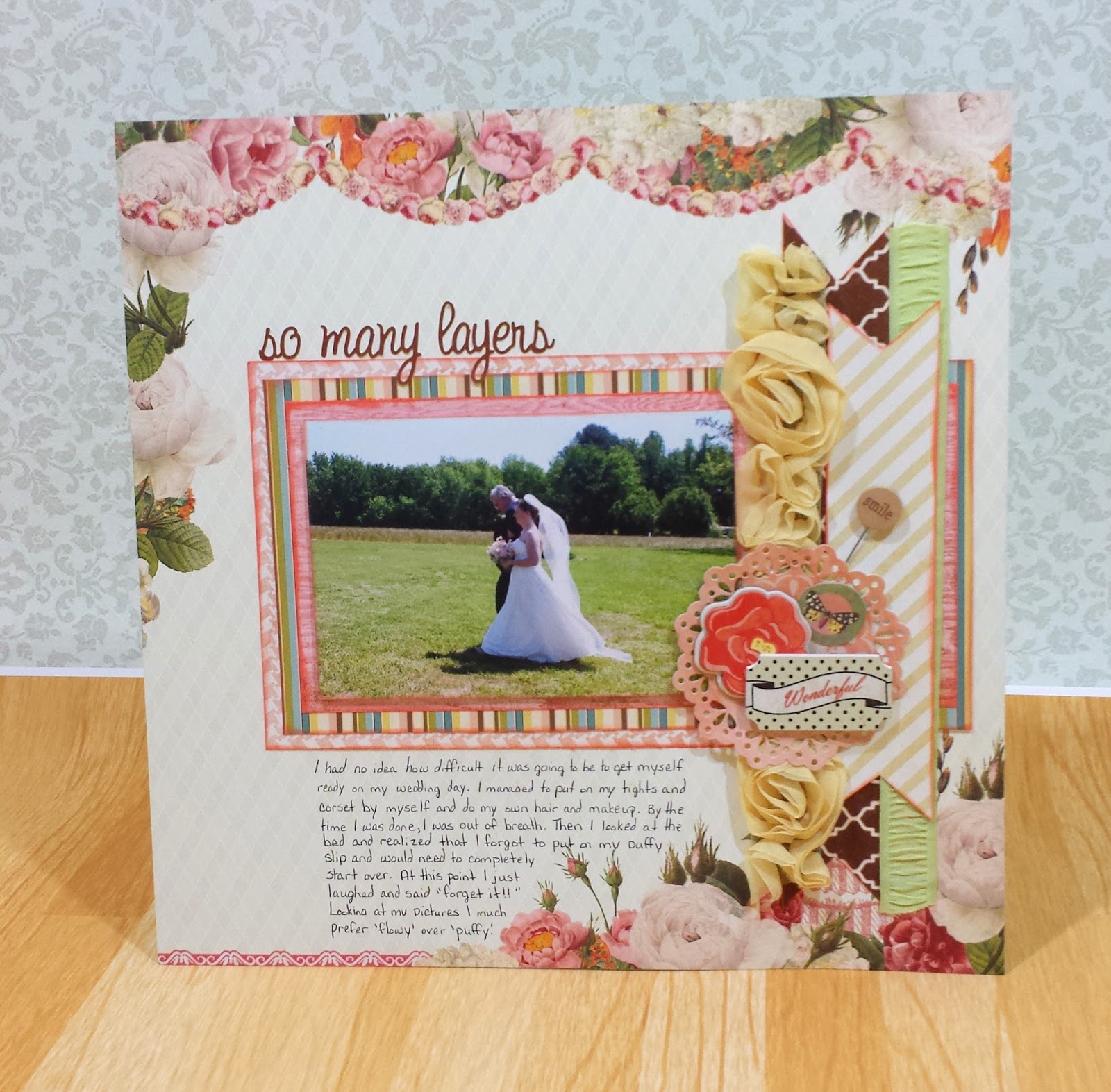


Paper - Webster's Pages-Let's Celebrate Collection, Webster's Pages - Garden Gala - Fresh Air, My Mind's Eye - Follow Your Heard - Be Happy - Favorite Things, My Mind's Eye - Lush - Brown Diamonds Paper   Embellishments - Little Yellow Bicycle - Stick Pins - Wood Words, Michaels - Wood Embellishments - Songs of Spring   Ribbon - American Crafts - Premium Ribbon - Greeting, American Crafts - Premium Ribbon - Yellow Rosettes


I'm so glad my Mother-in-Law was taking pictures because she caught one of my favorite shots: my dad beside me and my dress in all it's flowy goodness. This layout was all layered up with bits and pieces of scrap and ribbon. I tried to incorporate the red tones of the Webster's Pages paper with my inked edges. Unfortunately, I purchased most of the supplies when I got engaged, so I can't find any active links to any of it.

Hope you enjoyed this!


Monday, September 7, 2015

Paris - L'Objet qui Parle

When I was preparing to visit Paris, I used Pinterest as my personal tour guide. I wrote down all the little nooks and crannies that I thought I could squeeze into a week. I knew I'd probably never get a second chance to visit, so I didn't want to miss a thing! One of the places I uncovered was a place called L'Objet qui Parle (The Object that Speaks).


Paper - My Mind's Eye - Market Street Collection - Ashbury Heights - Vignette
When I was at Sacre Coeur, I took two streets over and at the bottom of the hill (near the Moulin Rouge) was L'Objet qui Parle. It was the size of a small closet and it was filled from the floor to ceiling with all kinds of antiques! I wish I could've bought more stuff but there's no way I could fit the giant antique mirror of my dreams into my luggage. :)

When arranging this layout, I wanted the look to have the same hodge-podge look as the shop itself. Little bits of paper hear and there with some texture. The Ashbury Heights Vignette from My Mind's Eye held just enough antique whimsy and color to really make the picture speak. And the Glassine kraft paper was actually the packaging I received when I bought some ribbon from A Paper Palette.

Hope you enjoyed this layout!


Tuesday, June 26, 2012

Tiny Bird with a Big Song - My Mind's Eye

When I laid my eyes on MME's paper, Songbird, I fell in love with the saying. "I feel like a tiny bird with a big song." It really struck a cord with me because when I got engaged I wanted to shout it from the rooftop. Even now, I can't help but weave wedding plans into any conversation. (I promise that I truly don't mean to. I just happens.) I just feel like I'm bursting with happiness and there's not aren't enough voices to sing it all. In my engagement photos, there was a succession of three photos. The one I loved the most was of me laughing. I know that it wasn't the most flattering of them all, but it really showed how I was feeling: happy, excited, and bursting with energy.


My Mind's Eye - Follow your Heart - Be Happy - Favorite Things, My Mind's Eye - Follow your Heart - Be Happy -  Happy Doily, My Mind's Eye - Follow your Heart - Be Happy - Striped Pink, My Mind's Eye - Follow your Heart - Be Happy - Songbird, The Paper Studio - Spare Parts - Doily Ribbon 3 pk, Spellbinders - Nestablities - Lacey Circles
The journaling reads: I had thought about cancelling our engagement photos because everyone said they were a waste of money. I'm so glad that we went ahead with them. They are so precious to me.

When in doubt, I can always fall back on simple design basics. You can't go wrong with a simple three photo layout with one photo enlarged. Your eyes automatically go to the enlarged image and then can wander equally between the outer two. This also works with color. If you want to draw attention to a specific photo, you can turn all the other photos Black and White and leave only one photo in color. To bring more attention to my center photo, I made sure to only mat that photo with white cardstock.


When I had finished my layout, I realized that I had an uneven page. The cluster at the bottom right seemed to weigh down that side of the paper. So, I knew I had to focus on the top left to even things back out. I cut out the doilies from Happy Doily using just regular scissors and not trying to be too accurate. I just went around the general shape. Then I used the Spellbinders die to cut them out. This gave me a very intricate cut and lots of detail. I placed them in between the papers to show the different layers.

I hope you enjoyed this layout and hopefully it gave you a little inspiration for your own projects. If you haven't already, make sure to follow my blog so you can get updates instantly!

Wednesday, June 20, 2012

Lovely. Beautiful. Darling. - My Mind's Eye

I know it might sound strange, but I looked forward to my engagement photos much more than I look forward to my wedding photos. When I look at wedding photos, I can't help but always see them as fairly basic: white dress, tuxes, and only the bridesmaid's dresses to add color. On the other hand, when I look at engagement photos, I see two people who are in love and can't wait to show the world. So, as soon as I got my photos in, I went to work making the light and romantic layouts that I've had planned in my head for months.

My Mind's Eye - Be Happy - Honey Pink, My Mind's Eye - Be Happy - Be You, My Mind's Eye - Be Happy - Favorite Things, My Mind's Eye - Be Happy - Striped Pink, My Mind's Eye - Be Happy - Follow Your Heart layered stickers, Tim Holtz - Tissue Tape - Symphony, Tonic Studios - Tim Holtz - Paper Distresser

I absolutely loved the cluster in the top right corner of 'Be You'. I didn't want to cover it up. So I decided to keep the majority of my page in the bottom left. I began layering with pieces of 'Honey Pink' that I had cut out with an exacto knife. The overwhelming color in the top cluster was pink, so I needed the pink piece to draw your eye down to the bottom of the page. (Believe it or not, your eyes automatically want to play connect the dots when it sees multiple objects of the same color. Cool huh?)


I added a layer of Tim Holtz's Tissue Tape to give a little weight to the background. With all the solids and stripes on a layout, it's nice to mix things up with an intricate pattern (use sparingly). Then, I started layering papers to give a nice background to my photo. I went around 'Favorite Things' with some machine sewing to add to the romantic feeling of the page. On the blue cardstock paper, I went around the edges with Tim Holtz's paper distresser. I like the shabby feeling it gave and when you're using a bunch of papers in a similar tone, it's always a good idea to infuse as much texture as possible. 


I've been looking for a reason to use those wonderful layered stickers on my layouts and this was just the ticket. I added one of the stickers to the bottom of my photo to help ground it down. Lastly, when I looked around my layout I noticed a lot of white space to the right of my photo that was oh-so-conveniently lined for my journaling. The scrapbook queens must have known I'd need it. 


The journaling reads: 
I absolutely love
 this man. 
He sees all my faults 
and simply smiles 
at them.
He is my constant.
He is my comfort.
When I look
at him, the
weight of the world is
off my shoulders
and I am home. 

I hope everyone enjoyed this. I've been going crazy with anticipation for my photos and I hope this layout does the picture justice. Make sure to stop by again soon!

Monday, March 19, 2012

Ruby Falls - Crate Paper

When winter begins to lighten and the first warm days of spring appear, we're all itching to get out of the house and do something. This time, Caleb and I decided to take a quick trip to Chattanooga, TN to enjoy the Aquarium. Along the interstate, we were bombarded with signs to visit Ruby Falls. Well, after we finished with the Aquarium we had plenty of day light left so we ventured forth towards Look Out Mountain where Ruby Falls is located. If you've never been to Ruby Falls, you really should visit their site to learn more. Although, I have to warn everyone.... it's very cramped inside. It felt like we were all sheep being herded through. Also, the air was thinner and quite musky down there so steer clear if you have a lot of allergy problems.

Crate Paper - Paper Heart Collection - ValentineCrate Paper - Paper Heart Collection -  FriendshipCrate Paper - Paper Heart Collection - CupidTattered Angels Glimmer Mist - Silver Sugar 

I had a lot of problems at first with colors. All the papers I put next to the picture just overwhelmed it or competed with it. If I picked a pink paper... it looked too violet. If I picked a violet paper...it looked too pink. So, I decided to go with a simple layout using a complementary color. I pulled out Crate Paper's 'Paper Heart' collection and it was just the ticket. The red-violet and yellow-green worked perfectly together. It was such a fun splash of color. (Oh, and a little bit of wood grain never hurts!)


One thing that I always have to watch for is what I call a 'sneaky color'. It's a color that looks like it shouldn't belong but you can't avoid. It might be that strange beach ball in the background that threw in a color you didn't want. For me, it was the lighting in the cave that turned the outside of my photo black. The colors of my papers would've looked best with grey as the dominant color, but I didn't have grey in my picture. So, instead of fighting that sneaky color, I embraced it. I made it my most used color. All the fonts, the stitching, everything was dashed with a bit of black.

Tuesday, February 28, 2012

New Ride - October Afternoon Sasparilla

October Afternoon's Sasparilla line is just what the doctor ordered. It's fun and masculine enough for any male in your life. It's very hard for me to find a collection that I can pair with photos of Caleb, so I jumped at the first chance to get my hands on it. I loved all the little journaling cards and embellishments that come with this collection. I was able to pile on some really awesome things and I still have a lot left for some more pages.

This page is about Caleb and his new Volvo. The old Dodge Intrepid finally gave up on us and departed this world with a blown head gasket. It was a good car and shall be missed. :::sniff sniff::: But the Volvo is awesome! It's such a fun and sporty little red car. He's so proud of it, so I just had to scrap him with his new ride. I'm so glad that one of the major colors in the Sasparilla line was red.


Please excuse any blurry photos. I just bought a new camera and I'm trying to get used to it. (It's very hard going from Donna's professional camera to my cheapy version.)  I started out with basic kraft paper and layered it on top of plain red cardstock paper. I went around the edges with Tim Holtz's Vintage Photo distress ink to give it a worn look. It gave me a double bonus because in some areas it looks like extra shadows.


I was originally drawn to Wilna's Creative Goals layout. I loved the negative shapes that were cut out. But, on my version, I wanted each negative shape to have a different pattern paper behind it. So I lightly traced out some stars and cut them out with an exacto knife. Then, I chose three different papers and secured them with my ATG runner. I originally wanted to go around the shapes with the sewing machine, but the stars were so small and had so many edges that I decided to use a pen instead.


The little flags are just so cute! I remember a while back when I just used kitchen toothpicks and a triangle cut out of paper. But these little guys are whittled to be extra decorative and they come with 10 different flags you can use. I covered the sheriff star with a shiny gold paper and it looked like real metal (but it didn't show up in the photos). For a final touch, I ran my layout through the sewing machine with a heavy black to bring out the car's wheels.

Hope everyone enjoyed this layout. The Sasparilla line was so bold and fun. I'm still looking around for more topics that I can use with it. I haven't even begun to use the yellow side of this set. Make sure to click the 'follow' button to the right to be updated with my newest layouts. If you'd rather get my posts in an e-mail version, just enter your e-mail address in the box provided to the right. (I promise you that I will never send you any spam or junk e-mail.)

Monday, February 27, 2012

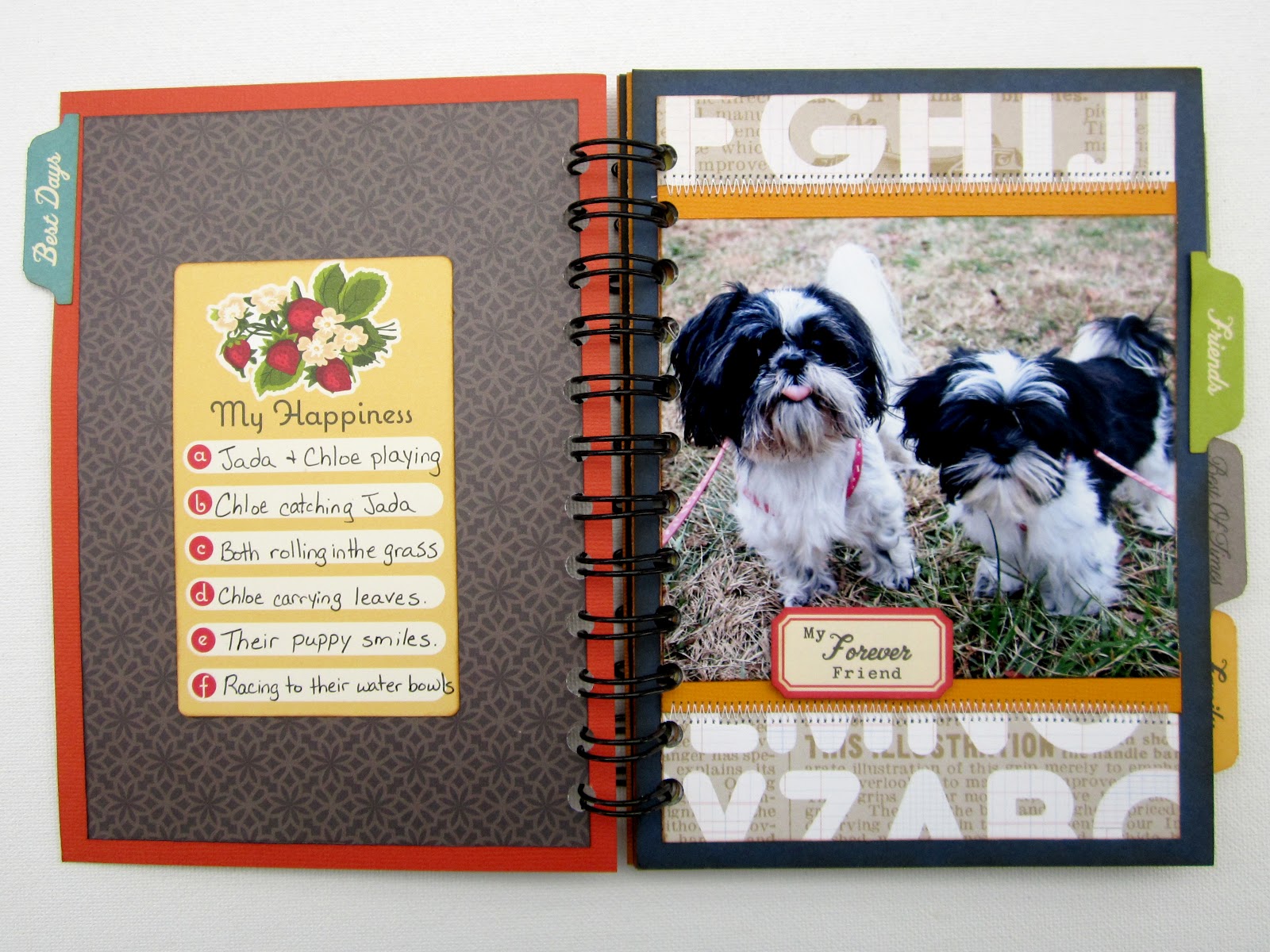
Jada and Chloe

I'm the girl who never wins anything. So, imagine my surprise when I won two things in one week! I received a wonderful kit from both Wilna and Keshet. I couldn't wait to use both kits and I was lucky enough to be able to use both on a cute little mini album. I had been wanting to scrap these pictures for a long time but I just couldn't find a real reason to scrap a full 12x12 layout. So, a mini was a fun way to scrap them separately.


Studio Calico - Classic Calico - Letterset, Studio Calico - Elementary - Atmosphere,  Studio Calico - Elementary - Harper's Rule, Studio Calico - Farmer's Market, American Crafts - CHAP - Jim, American Crafts - CHAP - Richard, My Mind's Eye - Good Day Sunshine - Sunny Stripes, October Afternoon - Boarding Pass - Chip 'n Stick, October Afternoon - Campfire Word Stickers, October Afternoon - Farmhouse Word Stickers, October Afternoon - Sidewalks Word Stickers, October Afternoon - 5 & Dime Label Stickers, October Afternoon - Modern Homemaker Label Stickers, October Afternoon - Cherry Hill Cardstock Stickers, October Afternoon - Farmhouse - Journal Cards, October Afternoon - Boarding Pass - Miscellany, 3L - 3D Foam Squares, The Cinch Binding Tool

Since both prize kits had lots of papers and embellishments with the same color theme, I was able to mix-and-match them along with some of my own stash. I have tons of October Afternoon stickers that I never seem to use up. I just use a couple of favorites and then put the rest away. It was a blast being able to pull them all out again. I felt like I was getting new stuff all over again.


Since each of the tabs came from a different collection, they all had different fonts. I actually loved them so much more because of it. They really gave a personal touch to the mini. And surprisingly, the colors all tied into my main paper and made it feel very cohesive. I also found a little trick to sewing in a mini. If you sew on the paper before you attach it to the main book, then you won't have stitching that shows through to the next page.


This mini was so easy to make. I tried not to embellish too much and instead let the papers speak for themselves. They're so bright and busy. Thanks to Wilna and Keshet for their wonderful gifts. They were so awesome and spot on for what I wanted to do. It's too bad that some of this stuff has been discontinued. I would've loved to pick some more back up. Well, I'm in the middle of two more projects for 'ya. Can't wait to share them with you all and hopefully you'll join me for more fun!


Monday, February 13, 2012

The Proposal - My Mind's Eye

Winter CHA 2012 was definitely full of amazing new goodies! ( Man, I wish I could have gone.) Anyways, I've been stalking the shopping section of Two Peas for weeks now...just waiting for the stuff to hit the rack. My Mind's Eye was one of the first collection up for grabs. And boy did I grab! I loaded up on the Be Happy and Be Amazing collections. The colors are so pretty and soft that I knew I wanted to use them for my wedding stuff. I'm sorry if wedding stuff is getting old....but I'm just bursting at the seams with it!

My Mind's Eye - Follow Your Heart - Be Amazing - Ephemera,  My Mind's Eye - Follow Your Heart -  Be Happy - Happy DoilyMy Mind's Eye - Follow Your Heart - Be Happy - Never Forget,  My Mind's Eye - Follow Your Heart - Be Happy - 12x12 Chipboard,  My Mind's Eye - Follow Your Heart - Be Happy - Transparency, Letters - The Silhouette 

This layout was put together very easily. I love that most of the papers already have embellished little alcoves. It makes it so easy to layer a couple of elements and create a full cohesive page. The chipboard accents that come with this collection are so awesome! They're self-adhesive so it's as easy as popping them out and sticking them down. The little honeycomb stickers are my favorite. :-)


I cut out one of the transparencies and layered it over my photo. I even cut out the little banner that was actually the collection title, but I just thought it was so cute! To make sure that you wouldn't see any glue or tape, I secured it by running it through the sewing machine. While I was at the sewing machine, I added some texture by crumpling up some lace and using it as a border. I didn't think to grab any letters to go with this collection (I'm not even sure there's any out yet). So, I grabbed some light grey paper and ran it through my FMIL's silhouette. The silhouette never cuts as well as my Cricut does, but I do enjoy the versatility of being able to choose any font on the computer.

I really hope you liked my layout! If you get a chance to pick up some of My Mind's Eye, do it! It's so fun and cute. I could really see this being used for a little girl or an anniversary. It's just so soft and feminine. If you want to be updated when I make a new project, make sure to click the follow button on the right or enter your email address. Thanks for stopping by!

Monday, February 6, 2012

The Shop - October Afternoon

I originally planned on doing this layout with the "Kitchen Cupboard" paper from October Afternoon's Farmhouse collection. But since I had just used that entire page on my last layout, I had to find a replacement page. I wanted a deep wood grain so I started to look through my new Two Peas goodies and I found Crate Paper's Valentine page. The color was spot on, and I actually like this page better because it was a simpler page than the OA one. It's so easy to layer on patterns when the background is only slightly textured.


October Afternoon - Farmhouse - Button Box, October Afternoon - Farmhouse - Her Bureau, October Afternoon - Farmhouse - Church Social, October Afternoon - Farmhouse - Clothesline, October Afternoon - Farmhouse - Guest Room, October Afternoon - Farmhouse - Word Stickers, Crate Paper - Paper Heart - Valentine, Tim Holtz - Distress Ink - Vintage Photo, Ranger - Glossy Accents.


This picture is very important because it's the family business. My grandfather was the type of person who never settled for 'good enough'. He created 3 successful businesses, but he always said that he could do more. Then (much to the aggravation of my grandmother) he borrowed money against their farm to build Davis Foreign Auto Parts. It was very successful and he was happy with it for the rest of his days. Once he passed away, it was left to my father. I always look at it with awe. It always takes courage to leave what is safe for the unknown. I've dedicated this page to the legacy he has left behind.


The title was a little tricky for me. I tried a bunch of different papers, but they all had too much pattern on them. It just looked so busy that you couldn't read it. Then, I looked at my cardstock... which didn't help. All the browns I could find were more reddish than I wanted. So, I got an old cream index card and began rubbing it with Tim Holtz's Vintage Photo distress ink. Then, I got on my FMIL's silhouette and cut out the title. I really like the chunky letters and the color is exactly what I wanted. Sometimes things are just easier when you do things yourself. :)


I often look around to get ideas and inspiration. A couple of weeks ago, I saw a layout with a very heavy banner. It was packed full and had different shapes and sizes of pennants. I really loved the fullness it gave, so I stored it in my mind. Unfortunately, I don't remember who the inspiration piece was made by. If you think it might have been you, please send me an email and let me know. I've seen a couple of heavy banners, but they aren't the inspiration piece.


I just love all the images on the "Her Bureau" page. They're just so fun and you can use them each as an embellishment. The little post stamp was tricky. If I were to cut each little perforation separately, then it would take me all day and still come out strange. So I found a trick. I just cut around the sides as close as I could. Then, I punched the little half circles out with a small hole punch. I was done in less than 5 minutes. I then cut out a couple of the buttons and covered them with glassy accents. Of course, I went around all edges with the Vintage Photo pad.

I hope you enjoyed this layout. I'm completely in love with this collection. I'll probably stock up and still be using this stuff next year! lol. If you want to stay up to date on all my projects, you can follow me by clicking the follow button or entering your email into the box located to the right side of this blog. Can't wait to hear from you!

Sunday, February 5, 2012

Featured

Let me start of by saying that I appreciate every single person who views my blog and I especially want to say thank you about all the wonderful comments I have received.  I was surprised to find that my layout "Joy Ride" went over as well as it did. I received such wonderful emails about it. I was glancing around TwoPeas when I came across this:


My layout actually won a challenge! I am surprised and so happy. Thanks everyone! Y'all are so wonderful! If you haven't already, make sure to click the follow button on the right so you can be updated when I add a new project. (I'm working out the bugs on the email subscriptions). Thanks bunches!

Thursday, February 2, 2012

Family - October Afternoon

Ever since Chloe has come into our lives, our days have been filled with vet visits, 4 walks a day, and being the referee between her and Jada. I wouldn't change a thing. It's been so exciting and fun but I've hardly had any time to actually scrap the pictures I've taken. But this past Tuesday I finally received my new package of goodies  from Two Peas. The Farmhouse collection from October Afternoon is absolutely wonderful in every possible way. It is so versatile and just screams to be used. The papers just flow so well together that it's so easy to mix and match. It can be used to scrap anything that feels old or vintage; however, it can also be something warm and home-y.


October Afternoon - Farmhouse - Button Box, October Afternoon - Farmhouse - Her Bureau, October Afternoon - Farmhouse - Faded Wallpaper, October Afternoon - Farmhouse - Church Social, October Afternoon - Farmhouse - Clothesline, October Afternoon - Farmhouse - Kitchen Cupboard, October Afternoon - Farmhouse - Word Stickers.

The journaling reads "Our happy family of three has now become a family of four. At first the idea of training another puppy worried me. Could I do it again? But now I can't see our family without Chloe." I started out with a couple of simple squares cut out and layered on top of each other. I loved it so much that I left it that way and only added embellishments to it.


I loved the little thread holders that were on one of the pages. I broke out my scissors and cut out one with yellow thread. It already had thread painted on it, but I decided that I wanted to wrap it in real thread for added affect. I placed a dot of glossy accents on the back to be sure that the thread didn't unwind. Then, I dug through my FMIL's stash of antique buttons for the final touch. 


I loved all the stickers that come with the Farmhouse collection. The word lists can all be lined up to add a border or stacked. They are so versatile. I loved this sticker that said My No.1 Key to Happiness. I just felt that it summed up my feelings of this photo. To finish off my page, I broke out the sewing machine and played around with the different settings for different stitches. 

Unfortunately, I only purchased one of each page. I didn't realize just how wonderful this collection is. I wound up using three different papers on this layout alone. I'm already getting my shopping cart ready for a replenishment shipment. These are just too fun. I always seem so surprise when I get anything October Afternoon. I always start out unsure, but once I get them in my hands, I fall in love!

Wednesday, February 1, 2012

Joy Ride - Ink Blowing

When Wilna posted her layout "Who Says?" over at Two Peas in a Bucket, I was hit with a lightening bolt of inspiration. I loved the grouping in the center and the way her journaling was sewed in a straight line on top of her photo. I couldn't wait to scraplift some of that. So, I plugged the image into my mind to save for a rainy day. But then I was walking through Staples (my personal candy store) when I came upon a journal:

Yet another lightening bolt struck me. I loved the bold colors and the way they seemed to be dripping onto each other. I had a photo in mind that was difficult to scrap because of all the colors that were in it. It always seemed out of place when I put scrapbook paper under it. But now I had an idea. I raced home and put all this inspiration to work.


Tim Holtz - Distress Stain - Wild Honey,  Tim Holtz - Distress Stain - Aged MahoganyTim Holtz - Distress Stain - Peeled Paint,  Tim Holtz - Distress Stain - Dusty Concord,  Tim Holtz - Distress Stain - Weathered WoodTim Holtz - Distress Stain - Scattered Straw, Ranger - Inkssentials - Glossy Accents, Ranger - Acrylic Paint Dabber - Snow Cap, Crafts Etc - Bead Treasures - Seed Beads - Yellow/Orange, Crafts Etc - Czech Glass Beads - Seed Beads - Purple/Aqua 


I had so much fun on this layout! I felt like a kid in kindergarten again, playing with paints and getting all messy. I used 6 different colors of distress stains to get the desired affect. I focused on making my colors less like a rainbow and more like the tail feathers of the rooster in my photo.


Does anyone remember making a picture by blowing on wet paint with a straw? Well, I looked at the journal with the dripping paint and that's what came to my mind. Word of caution though, You have to start with your lightest colors first and then you work your way to the darker ones. The colors show up better that way. Also, I don't think it would work so well with anything but the distress stains. Mists and stamp pads seem to dry to fast and the re-inkers are really thick so you'd have to water them down. Also, I couldn't find a brad that was colorful enough for me so I used some small beads and Glossy accents to make the flower centers.


When I finished my layout, I realized that I had accidently put 'chicken' instead of 'duck' on my journaling. I was really upset because I had already sewed my journaling down. But that just gave me a creative idea. I decided that I would use this opportunity to add color to my journaling. I cut out little strips of cardstock and colored them with my distress inks. Then I wrote the correct word on top and used pop dots to make them stand out. I repeated this with a couple of random words. When I was finished, I had to laugh at my quirky solution, but I was still really pleased. Speaking of journaling... here's a closeup of the picture so you can read along with the story and laugh:

                "Jada has many toys but there are only two that she consistently plays with. The duck and the pig. They’re pretty much identical - both are just small round balls with a squeaker in them. The only difference is one is pink  and looks like a pig and the other is yellow with an orange bill like a duck. We have no idea what the big deal is, but those are her favorites.
                One day, the duck went missing. We all looked high and low for it, but with no luck. It seemed to have dissapeared into thin air. A week went by and still no duck. Then one day, it mysteriously reappeared, but in an unusual way.
               I was sitting down watching tv when my eyes began to roam around the room where they landed on Donna’s metal rooster. Sitting, perched on top as if it was on a joy ride, was the missing duck. I have no clue how it got there, but there it was... staring at me. Perhaps Jada felt like her duck needed a break?"


I finished off my layout with my usual prima letters (I'm gonna miss them when I run out). I used my acrylic paint dabber to make the letters pure white so they wouldn't compete with the color on my page. I hope y'all enjoyed this fun layout. I think everyone should try the ink blowing technique. It's just so playful!

Monday, January 16, 2012

Bedtime Hug - Webster's Pages & Hot off the Press

Chloe has been a part of our family for about three months now but I haven't scrapped a single page of her yet. I've left some of her pictures on my desk hoping to get a little inspiration, but I've been constantly stuck. (I guess all the wedding stuff has become my prime focus.) So, I was looking around the internet and came across two separate sources of inspiration: 1.) Color Combos Galore #215  2.) Lynn Ghahary - Country Boys. I loved the soft colors and feminine texture of the CCG challenge and the soft hearts on Lynn's page. So here's my attempt to merge the two!

Hot Off the Press - Color Me Flowers, Webster's Pages - Lullaby Lane - The Arrival, Ranger - Tim Holtz - Distress Ink - Spun Sugar,  Ranger - Tim Holtz - Distress Ink - Vintage Photo, American Crafts - Thickers - Maple - Black, Fiskars Border Punch - Flowers

The background paper was so much fun to work with because it was an ink resist paper. I started out rubbing it with Spun Sugar but it seemed too pink. So I opened up the ink drawer and looked for a neutral. I finally decided on Vintage Photo to tone it down with. I'm pleasantly surprised with the exact hue I finished with. My only words of wisdom with these kinds of paper is to start out with your lightest ink first. It's easy to add color to darken, but it's a lot harder to lighten once you've made a mistake. Try testing a small corner or an area that you plan on covering up.


I've really been into the texture that border punches give. So I decided to stack a couple of them on top of each other. I liked the look that I got, but they just seemed to blend in together too well. So, on every other edge I rubbed some more Vintage Photo ink. I really gives it a little more depth. Some machine stitching also made an appearance on this layout. It's just such an easy way to make a layout look more finished. I stitched a border around my entire layout as well as around my photo. The stitching also appeared on those sweet little hearts. Speaking of those hearts....

here's those adorable little hearts from Lynn's page. I just loved the sweet feel it brought to the page as well as the texture that it brought from the right to the left. I always try to balance out my page. I had a heavy texture on the right, so I needed texture on the left. I did the same with the title. My little puppies are black and white so it's always hard to work black in somehow. I know that it would probably make more sense to use the brown letters, but they just seemed to fade into the background. By using the black letters, I brought the black from the photo over to the left side of the layout.

I had fun on this layout. It was the first time I've ever used an ink resist paper but I've concurred my fear. I actually want to do more with these diverse products. Hope you'll join me for the next time!