Monday, March 19, 2012

Ruby Falls - Crate Paper

When winter begins to lighten and the first warm days of spring appear, we're all itching to get out of the house and do something. This time, Caleb and I decided to take a quick trip to Chattanooga, TN to enjoy the Aquarium. Along the interstate, we were bombarded with signs to visit Ruby Falls. Well, after we finished with the Aquarium we had plenty of day light left so we ventured forth towards Look Out Mountain where Ruby Falls is located. If you've never been to Ruby Falls, you really should visit their site to learn more. Although, I have to warn everyone.... it's very cramped inside. It felt like we were all sheep being herded through. Also, the air was thinner and quite musky down there so steer clear if you have a lot of allergy problems.

Crate Paper - Paper Heart Collection - Valentine, Crate Paper - Paper Heart Collection -  Friendship, Crate Paper - Paper Heart Collection - Cupid, Tattered Angels Glimmer Mist - Silver Sugar 

I had a lot of problems at first with colors. All the papers I put next to the picture just overwhelmed it or competed with it. If I picked a pink paper... it looked too violet. If I picked a violet paper...it looked too pink. So, I decided to go with a simple layout using a complementary color. I pulled out Crate Paper's 'Paper Heart' collection and it was just the ticket. The red-violet and yellow-green worked perfectly together. It was such a fun splash of color. (Oh, and a little bit of wood grain never hurts!)


One thing that I always have to watch for is what I call a 'sneaky color'. It's a color that looks like it shouldn't belong but you can't avoid. It might be that strange beach ball in the background that threw in a color you didn't want. For me, it was the lighting in the cave that turned the outside of my photo black. The colors of my papers would've looked best with grey as the dominant color, but I didn't have grey in my picture. So, instead of fighting that sneaky color, I embraced it. I made it my most used color. All the fonts, the stitching, everything was dashed with a bit of black.

Monday, March 12, 2012

Giveaway results!

Hey everyone! I hope y'all had as much fun as I did! Without further ado, let's get started. With a lead of 49 to 33, the blog header I'll be using is B. And now the winner of the Two Peas in a Bucket gift certificate is:


So, Brenda Lee, just send an email to tiffanydenisedavis at gmail dot com. That way I'll know the exact email to send your gift certificate to. To everyone who didn't win, I hope you'll continue to stop by. I had so much fun that I'm already planning another giveaway very soon.

Saturday, March 3, 2012

Under Construction- Giveaway!


You've probably noticed a lot of changes here at Vibrant Valley Design. I promise, it hasn't been to confuse anyone. As a graphic designer, I have to be able to change for each client. Some clients like very artsy things, some only like clean and modern, some prefer feminine swirls while others want masculine  stripes. I'm constantly trying to make what other people like. Unfortunately, when your career is about other people's tastes, you seem to lose your own. To make things even harder, I'm a perfectionist. So, I've been diligently trying to find my style these past few weeks but I've come to my latest dilemma...which blog header should I use?

So, I've decided to make a fun giveaway out of it. On Monday 12th, I will give a $25 gift certificate to one lucky winner! In order to be in the drawing, you must be a follower. Just leave a comment letting me know which blog header you prefer best (A or B). I'd also be very grateful if you can tell me why. You may only comment once. If you place my blinkie on your blog, you may leave a second comment (but you must let me know the blog address in your second comment).


A.


B.

Remember, you have until March 12th to enter. Good luck to everyone who enters!


Thursday, March 1, 2012

Celebrate Card - October Afternoon's Sasparilla

You'll have to excuse me for making this post so short. My entire family has been sick the past two weeks and I just now got it. So,I'll just have to make this short and sweet, then off to bed.

I loved this October Afternoon collection, but I didn't have any more pictures that I could scrap with it.  :(  But, the more I looked at it, the more I wanted to play with it. So, I made a compromise...using only scraps left over, I made a card.


One of the wonderful things about this collection is that it can really be used for anything. The colors are rich and bold, but it only looks 'western' when you use the embellishments. I absolutely love the blue polka dot pattern and I could reuse it multiple times. This card I specifically wanted to be playful and western so I used the Sasparilla 'Little Flyers' and 'Miscellany' to give a little character. The little cowboy card looked so cute. It made me think that he was inviting me to have some fun. So, I made the little flag into a celebration flag. I think this would be really cute as a kid's party invite. How 'bout you?

Tuesday, February 28, 2012

New Ride - October Afternoon Sasparilla

October Afternoon's Sasparilla line is just what the doctor ordered. It's fun and masculine enough for any male in your life. It's very hard for me to find a collection that I can pair with photos of Caleb, so I jumped at the first chance to get my hands on it. I loved all the little journaling cards and embellishments that come with this collection. I was able to pile on some really awesome things and I still have a lot left for some more pages.

This page is about Caleb and his new Volvo. The old Dodge Intrepid finally gave up on us and departed this world with a blown head gasket. It was a good car and shall be missed. :::sniff sniff::: But the Volvo is awesome! It's such a fun and sporty little red car. He's so proud of it, so I just had to scrap him with his new ride. I'm so glad that one of the major colors in the Sasparilla line was red.


Please excuse any blurry photos. I just bought a new camera and I'm trying to get used to it. (It's very hard going from Donna's professional camera to my cheapy version.)  I started out with basic kraft paper and layered it on top of plain red cardstock paper. I went around the edges with Tim Holtz's Vintage Photo distress ink to give it a worn look. It gave me a double bonus because in some areas it looks like extra shadows.


I was originally drawn to Wilna's Creative Goals layout. I loved the negative shapes that were cut out. But, on my version, I wanted each negative shape to have a different pattern paper behind it. So I lightly traced out some stars and cut them out with an exacto knife. Then, I chose three different papers and secured them with my ATG runner. I originally wanted to go around the shapes with the sewing machine, but the stars were so small and had so many edges that I decided to use a pen instead.


The little flags are just so cute! I remember a while back when I just used kitchen toothpicks and a triangle cut out of paper. But these little guys are whittled to be extra decorative and they come with 10 different flags you can use. I covered the sheriff star with a shiny gold paper and it looked like real metal (but it didn't show up in the photos). For a final touch, I ran my layout through the sewing machine with a heavy black to bring out the car's wheels.

Hope everyone enjoyed this layout. The Sasparilla line was so bold and fun. I'm still looking around for more topics that I can use with it. I haven't even begun to use the yellow side of this set. Make sure to click the 'follow' button to the right to be updated with my newest layouts. If you'd rather get my posts in an e-mail version, just enter your e-mail address in the box provided to the right. (I promise you that I will never send you any spam or junk e-mail.)

Monday, February 27, 2012

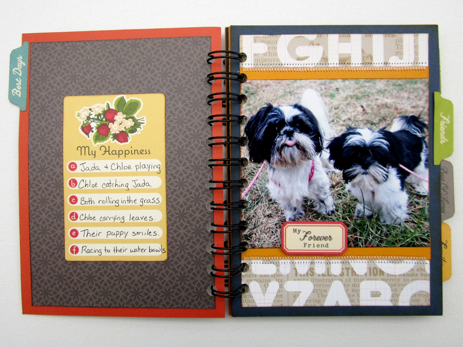
Jada and Chloe

I'm the girl who never wins anything. So, imagine my surprise when I won two things in one week! I received a wonderful kit from both Wilna and Keshet. I couldn't wait to use both kits and I was lucky enough to be able to use both on a cute little mini album. I had been wanting to scrap these pictures for a long time but I just couldn't find a real reason to scrap a full 12x12 layout. So, a mini was a fun way to scrap them separately.


Studio Calico - Classic Calico - Letterset, Studio Calico - Elementary - Atmosphere,  Studio Calico - Elementary - Harper's Rule, Studio Calico - Farmer's Market, American Crafts - CHAP - Jim, American Crafts - CHAP - Richard, My Mind's Eye - Good Day Sunshine - Sunny Stripes, October Afternoon - Boarding Pass - Chip 'n Stick, October Afternoon - Campfire Word Stickers, October Afternoon - Farmhouse Word Stickers, October Afternoon - Sidewalks Word Stickers, October Afternoon - 5 & Dime Label Stickers, October Afternoon - Modern Homemaker Label Stickers, October Afternoon - Cherry Hill Cardstock Stickers, October Afternoon - Farmhouse - Journal Cards, October Afternoon - Boarding Pass - Miscellany, 3L - 3D Foam Squares, The Cinch Binding Tool

Since both prize kits had lots of papers and embellishments with the same color theme, I was able to mix-and-match them along with some of my own stash. I have tons of October Afternoon stickers that I never seem to use up. I just use a couple of favorites and then put the rest away. It was a blast being able to pull them all out again. I felt like I was getting new stuff all over again.


Since each of the tabs came from a different collection, they all had different fonts. I actually loved them so much more because of it. They really gave a personal touch to the mini. And surprisingly, the colors all tied into my main paper and made it feel very cohesive. I also found a little trick to sewing in a mini. If you sew on the paper before you attach it to the main book, then you won't have stitching that shows through to the next page.


This mini was so easy to make. I tried not to embellish too much and instead let the papers speak for themselves. They're so bright and busy. Thanks to Wilna and Keshet for their wonderful gifts. They were so awesome and spot on for what I wanted to do. It's too bad that some of this stuff has been discontinued. I would've loved to pick some more back up. Well, I'm in the middle of two more projects for 'ya. Can't wait to share them with you all and hopefully you'll join me for more fun!


Monday, February 13, 2012

The Proposal - My Mind's Eye

Winter CHA 2012 was definitely full of amazing new goodies! ( Man, I wish I could have gone.) Anyways, I've been stalking the shopping section of Two Peas for weeks now...just waiting for the stuff to hit the rack. My Mind's Eye was one of the first collection up for grabs. And boy did I grab! I loaded up on the Be Happy and Be Amazing collections. The colors are so pretty and soft that I knew I wanted to use them for my wedding stuff. I'm sorry if wedding stuff is getting old....but I'm just bursting at the seams with it!

My Mind's Eye - Follow Your Heart - Be Amazing - Ephemera,  My Mind's Eye - Follow Your Heart -  Be Happy - Happy Doily, My Mind's Eye - Follow Your Heart - Be Happy - Never Forget,  My Mind's Eye - Follow Your Heart - Be Happy - 12x12 Chipboard,  My Mind's Eye - Follow Your Heart - Be Happy - Transparency, Letters - The Silhouette 

This layout was put together very easily. I love that most of the papers already have embellished little alcoves. It makes it so easy to layer a couple of elements and create a full cohesive page. The chipboard accents that come with this collection are so awesome! They're self-adhesive so it's as easy as popping them out and sticking them down. The little honeycomb stickers are my favorite. :-)


I cut out one of the transparencies and layered it over my photo. I even cut out the little banner that was actually the collection title, but I just thought it was so cute! To make sure that you wouldn't see any glue or tape, I secured it by running it through the sewing machine. While I was at the sewing machine, I added some texture by crumpling up some lace and using it as a border. I didn't think to grab any letters to go with this collection (I'm not even sure there's any out yet). So, I grabbed some light grey paper and ran it through my FMIL's silhouette. The silhouette never cuts as well as my Cricut does, but I do enjoy the versatility of being able to choose any font on the computer.

I really hope you liked my layout! If you get a chance to pick up some of My Mind's Eye, do it! It's so fun and cute. I could really see this being used for a little girl or an anniversary. It's just so soft and feminine. If you want to be updated when I make a new project, make sure to click the follow button on the right or enter your email address. Thanks for stopping by!