Sunday, July 24, 2011

Altered Digital Photo Frame

Hey there everyone! Got a new project for you to view.


My FMIL began decorating her digital photo frame. It was so beautiful that it inspired me to decorate my own. She went with deep jewel tones and black, so I went to the opposite spectrum with white and peach.


I started by removing the frame from the main base of the photo frame. I didn't want to get anything on the screen (since I'm a complete mess when I'm crafting). After the screen was set aside, I coated my entire frame with yellow acrylic paint. It took 3 coats to get the opaque finish that I needed. Don't worry, this isn't how it's going to look when it's done.


I then covered the frame with a thick coating of crackle medium. Once that had dried completely, I layered on a layer of white. Then it was time to set back and watch the magic. When the white paint cracked, the yellow was able to show through nicely.


While I was waiting on the crackle to take effect, I gathered all my materials. I used flowers from Michael's and Recollections, trinkets from Blue Moon Beads and Traditions, and ribbon from Michael's.


This little locket is absolutely adorable. Since it's see through, I painted the inside with yellow so it would bring attention to the detailing on it.


Funny story about this little guy. I am a HUGE fan of Disney-Pixar's movie, UP. And there's no character I love more than the lovable pooch, Doug. There's random parts of the movie when Doug and other dogs randomly shout "Squirrel!!" It's become and inside joke to me and my loved ones. So, when I saw this little squirrel, I grabbed it right away. Now I smile even more when I look at my photo frame.


I added little circles of pearls here and there and I love the light vintage feel that it gave my overall look.


My FMIL gave me some trinkets to use out of her own stash. A lot of her trinkets actually come off of old bracelets that she finds at yard sales and thrift stores.


When I purchased these beautiful Recollections butterflies, they were very yellow. I wanted to warm one up a little bit, so I sprayed it with Tattered Angels Peach Delight. It gave it just the tint I was wanting.


I had so much fun doing this! And the great thing is, now my digital photos will flip through such a beautiful scene. I never would've thought to play with a digital photo frame. Isn't my wonderful FMIL so inspiring?! I just had to get a picture of them side by side so you can see the stark differences between  them. So, I'll leave you with that photo.

Wednesday, July 20, 2011

Waiting


My wonderful FMIL took an adorable picture of Jada. (I swear, that dog has more pictures than a Hollywood celebrity!) The picture shows Jada peering out the window waiting for us. Anyone who knows Jada also knows that this is an everyday occurrence for her. She's always waiting for us and she becomes so happy and excited when we come home. You can have the worst day in the world, but when you come home you can't help but smile as she stands on her hind legs waiting on you to pick her up and love her. That's why I thought the title 'Waiting' was so appropriate.

But even though I had found a title, I had no clue where to begin. I didn't want to put it on a white cardstock background because it would lose some of its warmth. I had tried cream cardstock, but it still didn't seem right. Then, my FMIL and I visited our LSS and I ran across and adorable paper! It's Kaiser Craft's Homemade Collection- P569 Friendly Family. It has a beautiful retro design on the font and a soft textured back. I got two pages of it so I cold use one side as a background and the other side as an accent page.


I've been seeing so many of the cute little kite banners, but I've never had the guts to do one. Well, here's my attempt. Did I succeed? LOL. I used Viva Decor's Perfect Pearl Pens to connect the edges of my banner in the top right corner. The home sweet home paper is actually the info at the bottom of the paper. It's the piece that has the manufacture info that you usually cut off. (They are making those so cute that you never throw them away!)


The journaling says "Nothing washes your troubles away like seeing the unconditional love of a dog waiting for you". I lined all of my journaling and papers with Paper Studio's cardstock to help it stand out. And the finishing touch was American Crafts Thickers. I love the Marquise chipboard letters because they look like they have stitching on them which added to my "Homemade" look. I just love the little details that go into everything.

I hope you enjoyed this layout and please show your love for my blog by following it and leaving comments. I can't wait to hear from you!

Tuesday, July 5, 2011

Mini Recipe Album

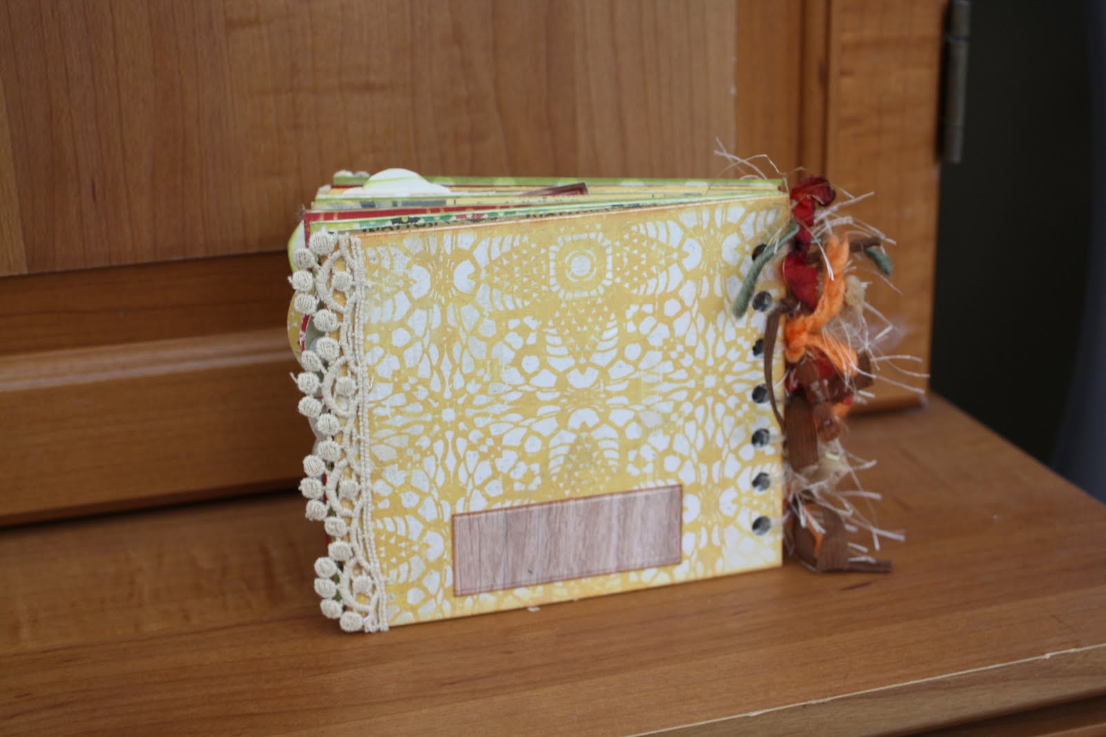
This project was originally going to be the mini album to give to my wonderful FMIL. But once I got started, it just didn't seem like what I wanted to give her. So I stopped working on it and started on my Victorian mini album. Well, now that the Victorian mini album went over so well with her, I decided to come back to the envelope album. I found an adorable page with lots of embellishment possibilities (Kaiser Craft- Nan's favorites collection-Lemon Slice). I cut out pieces and used them as embellishments throughout the album. This gave my album a recipe book feel. So I went with it! It looked so cute and retro.

The embellishment that I put on the front was a little altered. It originally said "Easy as Pie" but I wanted it to say "Made with Love". So, I scanned the paper into Photoshop. I used the patch tool to erase all the words and blend the background. Then I got my own type tool and looked for a font that seemed similar. After I was happy with the look, I printed it out on cardstock and cut it out with an exacto knife.


To the left is a close-up of the binding. I used Graphic 45 fibers, Fun Fur, and dyed seam binding. I may add more later. The binding was made up of clear hair elastics. I really loved the way it turned out because not only is it stretchy, but it's also clear. Clear binding won't disrupt my papers or take away from them.
I found some cute tiny letters from Cosmo Cricket. They worked perfectly for my small scale.


The tabs for each page were made using a 1.5" punch from EK Success.

Each page has two cards inside for ingredients and instructions. I tried to leave the front of each card blank so I can attach a picture of the finished meal.

I added depth to my embellishments by using 3D dots to pop them up.

My wonderful FMIL gave me envelopes to put on my pages. They looked so cute, but I have no idea who makes them. I think she might have made this one.

 I used Studio G ink in a variety of colors to go around the edges of my pages and give them depth. The bottom strip of paper in the picture to the left was actually the cut off portion of a Sassafras paper. It had the title of the paper and the bar code on the back. Normally, you would throw it away, but it just looked so cute that I kept it.

The paper on the left side accidently got pasted on upside down. So I put a paper doilie on it to give it texture and to hide my mistake.

I wanted to have a spot on the back where I could write down the date or a sentiment if I wanted to give it as a gift.


I hope everyone enjoyed this little album as much as I did. I can't wait to add my photos and recipes to this little guy. I showed it to my FMIL and she decided to make one too! (Although her's is already looking better! LOL).

Materials Used:
Ink- Studio G
3D Dots- EK Success
Paper- October Afternoon- Seaside- Sailboat
            Lilybee Design- Catching Fall- Cashmere Sweater
           Crate Paper- Restoration Collection- Lace
           Echo Park- For the Record- Fabric Store
           Sassafras-Applejack- AJSLDSP - 11402
Type-  Cosmo Cricket- Tiny Type
Adhesive- Terrifically Tacky Tape
     

Saturday, June 25, 2011

He wants to fly!

My dad has been building an airplane for a few years now. It recently hit me that I have never taken a single picture of him throughout the process. Well, I quickly ratified that! I wanted to have this layout done before Father's Day, but it didn't work out that way. I have a habit of stopping in the middle of a page. If I feel like I'm stuck, I'll just put the page away. Later, if I feel a little more creative, I'll come back and pick it up. Pushing myself to do a layout when I don't feel the creativity just results in a page I'm not happy with. So don't feel bad about about stepping away and saying "I'll come back to it later."


When I saw Graphic 45's Transatlantique paper line, I knew that it would be perfect. The colors are very guy-appropriate and it even had an airplane blue print. I have no clue what ribbon that is (it was from my scrap stash), but I hope I can find out soon. It was self-adhesive! All I had to do was peel the backing off and stick it to the page. It was so wonderful and mess free!


All of the yellowish paper is actually index cards. I used Studio G stamp pads in yellow and brown to layer on the color until I got just the right hue. I wanted it to be soft looking and a little distressed.


I've seen some really cute post card stamps, but I don't own one. So I got on Photoshop Illustrator and printed one out onto my post card. Then I added a postage stamp from one of the papers.

The letters got a little lost with the detailed background. So, I outlined the letters with a black ink pen. Hope you all liked it!

Wednesday, June 15, 2011

Bubbly

Ah, bubbly summer layouts! They just make me so happy. These pictures where so bright and colorful, so I wanted to find a paper that went with that feeling. I found this adorable double-sided polka-dotted paper in my scrap stash. (It had no markings on it, so I have no idea who makes it.) The green pattern on the individual circles is the backside. 

I originally had everything on a yellow patterned background. But when I started laying out all the papers and the pictures, it all looked so overwhelming. I replaced the yellow background with a white one and this seemed to let the patterns really pop. However, a new problem arose. All the papers seemed to disappear. So, I put a black edge around all of it. It really gave the colors a great base. 


Tuesday, June 14, 2011

Summer time is definitely here!

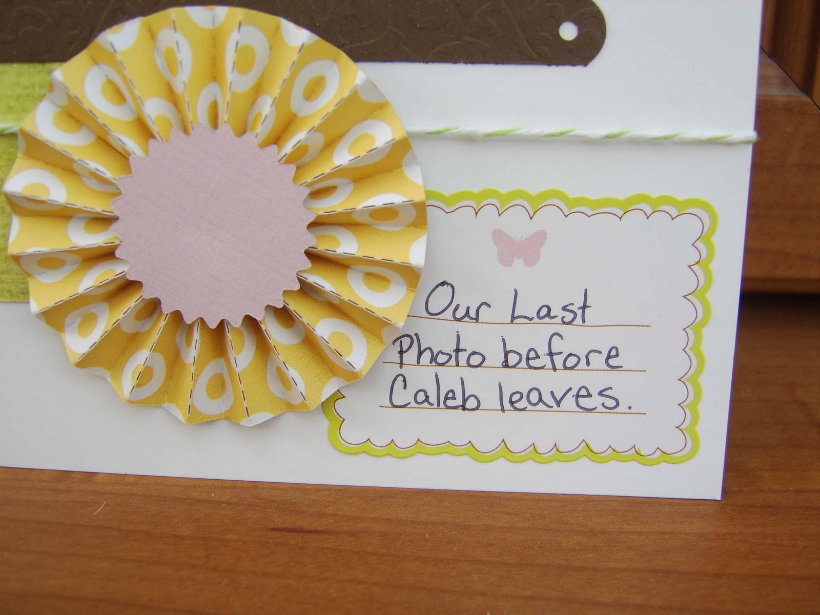
It's summertime. Time for cook-outs, pool parties, and cool treats. Everything gets brighter, and that includes scrapbook papers. Bright Oranges, Crisp Greens, and Lovely Yellows all come out of hibernation. Since Caleb will be heading out for a 2 month long business trip, I decided that it would be a great time to take some pictures of our little family. I wanted to be sure that he would be able to leave with a couple of sweet wallet pictures. Jada (although a little hesitant) warmed up to the idea of pictures.

Once I got all of my pictures printed out, I went to work. Using some of the freebies I won from a Two Peas challenge, I was able to map out my color combo. This is the front of American Crafts- Hello Sunshine- Good Morning Remarks Stickers.


I absolutely loved the green, blue, yellow, and brown. The hot pink was a little too much for me.


Hope you all enjoyed this one. The colors came out really light in the pictures but they look fabulous in real life.

Products Used:
Papers:   American Crafts- City Park
                American Crafts- Cardstock- Chestnut Damask
                My Mind's Eye- Head in the Clouds
                My Mind's Eye- Where the Heart is
Stickers: American Crafts- Hello Sunshine - Good Morning Remarks Stickers


Sunday, June 12, 2011

Mini Album Surprise

I've been away for a while working on a surprise project. And here it is!


My wonderful FMIL and I decided to do a mini album swap. This obviously took me a long time. But I finally finished it. I tried to make it look like an old Victorian house.


This mini album was secured using hair elastics. You can see a close up of them in the image below.


The brown tag fits into the pink pocket for a journaling spot. The pink pocket then fits into the brown pocket for yet another.


I used a 3 inch span of floral ribbon to make a pocket. It was secured on three sides by Glossy Accents.


The orange circle is actually a can top from a frozen juice can. After it was washed, I cut out some pretty paper to fit inside of it. Then I filled it in with glossy accents. On the back, I attached another circle of solid Cardstock to give a nice journaling spot.


Here's a close up of what the 'siding' looks like. Each strip of paper was secured with Terrifically Tacky Tape. Hope you all enjoyed this!

List of Products Used:
Coredinations Cardstock
SEI- Morning Meadow Collection- Hazel
Kaiser Craft- Chanteuse Collection- Eco
                  English Rose- Florence
Webster's Pages
Paper Pizazz- Tan Catalog
We R Memory Keepers- Grandma's Kitchen- Pen Pals
Prima accents
Terrifically Tacky Tape
Glossy Accents